


Role
Senior Product Designer (Lead)
Timeline
July 2021 to January 2023
Responsibilities
Brief Overview
Speakeasy Live was an education-focused social platform combining live shows, podcasts, and chat.
There were 2 user types: creators and listeners. Creators could host live shows, monetize through tips and subscriptions, create replays, and more. Listeners could browse shows, join, chat, request to speak, and tip.
I started as the sole designer in July 2021 when the app was in open beta with a handful of basic controls. Over the next 18 months, we added essential features that creators needed to run a show, including recording, premium subscriptions, moderation, Q&A queues, participant management, tipping, and per-message replies. By November 2022, the interface included nearly 30 controls across show, participant, and chat.
The design problem was how to keep adding features to a real-time interface over the next few years without making it cluttered.
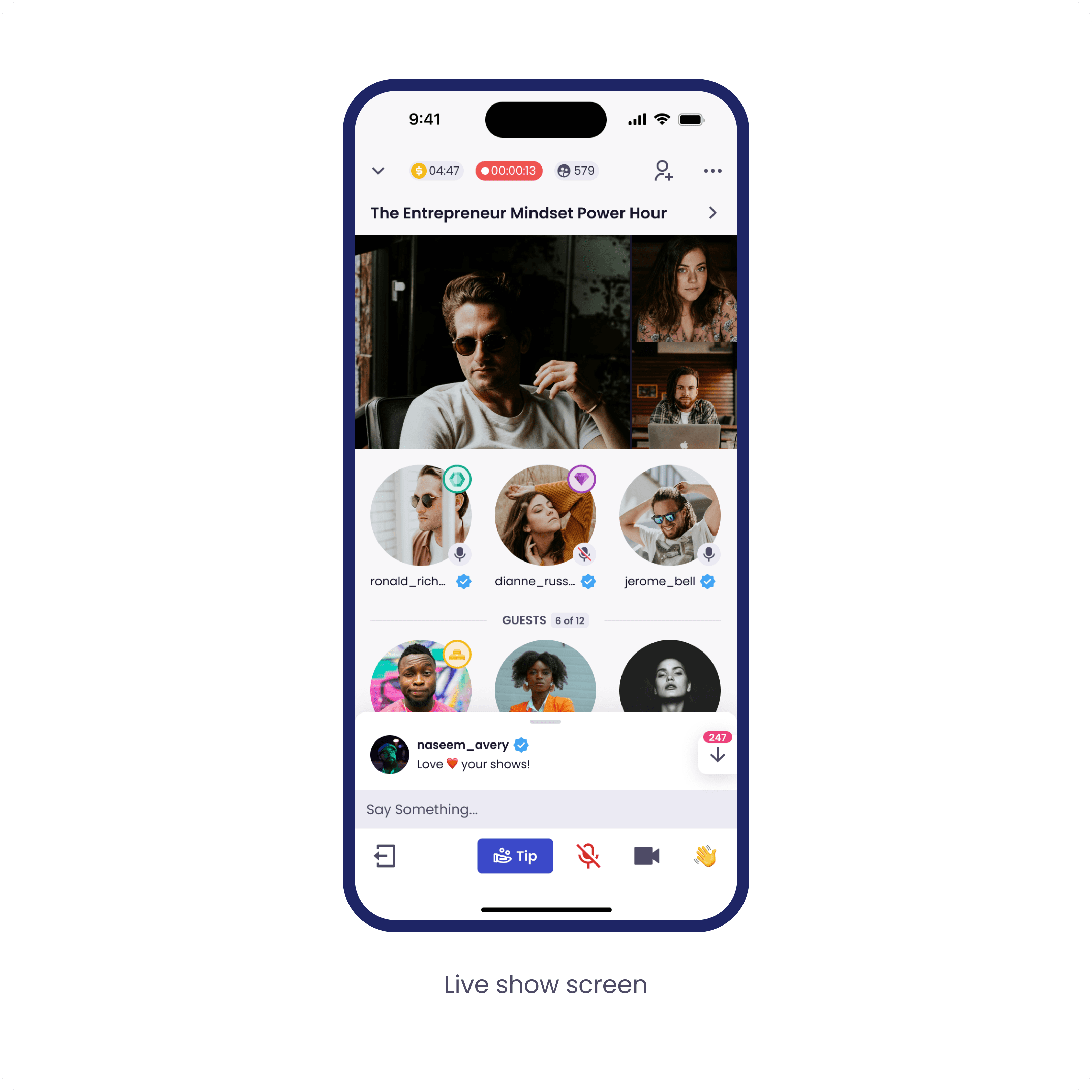
I organized the screen into three layers based on how often actions were used and their urgency. Frequent actions stayed visible at the bottom bar, other settings in the menu, and per-participant actions opened in a modal. This approach guided every feature added after.
We continuously gathered feedback from the founders, beta testers, and our own testing. By late 2022, the focus shifted from understanding how the interface worked to deciding what to develop next.
The product reached over 30,000 registered users and had 2 million cumulative iOS sessions before development stopped in January 2023 due to funding issues unrelated to design.


The Design Problem
When I joined, the live show interface had a few basic controls: mic on/off, camera on/off, reactions, and leave.
Over the next 18 months, we added what creators needed to run a show:
show recordings
premium shows
private shows
tipping
invites
Q&A queues
pinning and replying in messages
moderator assignment
participant management with three states (guest on stage, Q&A queue, audience).
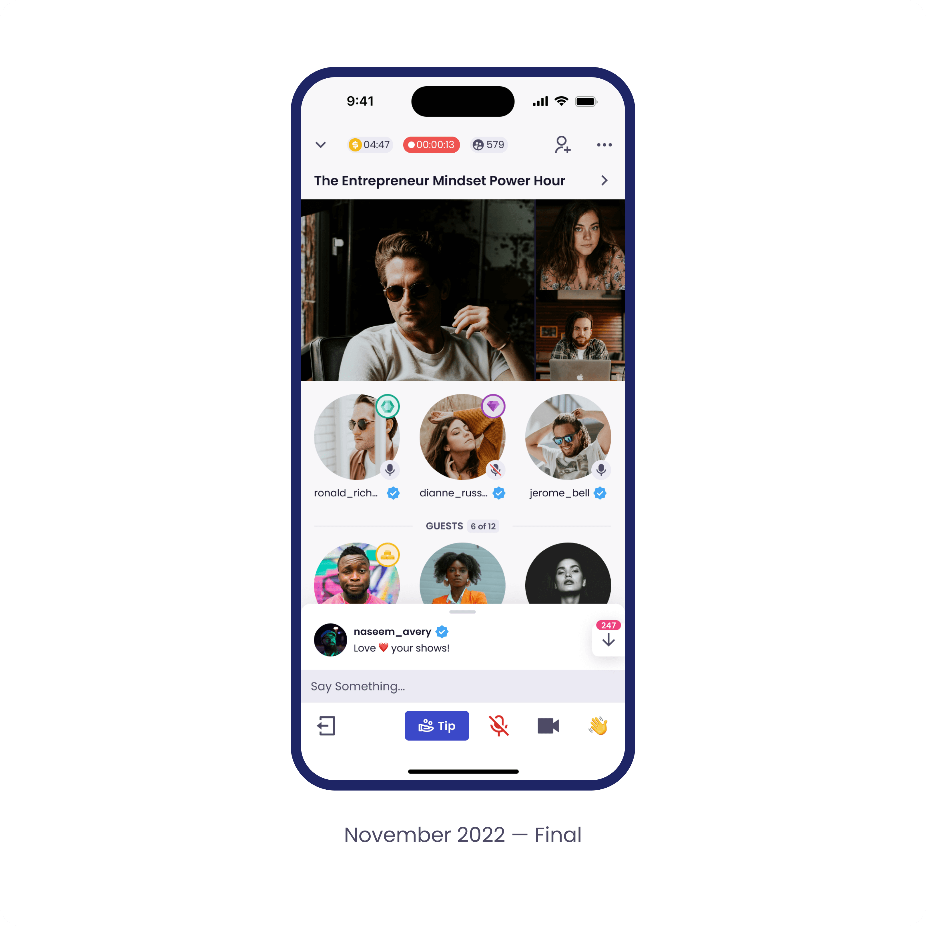
By November 2022, the interface held nearly 30 controls across show, participant, and chat.
The design problem was how to keep adding features to a real-time interface over the next few years without making it cluttered.
A live show isn’t a normal interface. The creator is talking to an audience, watching chat, deciding who to invite to speak, and managing the guests already on stage. All at the same time, in real time, with no opportunity to pause. Every extra tap risks losing the audience’s attention.
Early choices shape how the product evolves.


Key Decisions
The interface became clear due to two key decisions, each addressing a different level of scale: structural and component-level.
Decision 1: A three-layer hierarchy
The bottom bar began with 4 buttons: Leave, Mic, Camera, and Reactions. As new features were added, I had to decide which belonged in the bar. I tried adding Hide Chat there, but realized it was not used frequently enough. Placing it there would have crowded the primary controls, so I moved it to the settings menu.
That decision led to a lasting rule: if an action isn't frequent or time-sensitive, it stays out of the bottom bar. This principle shaped a three-layer interface:
Frequent, time-sensitive actions stayed at the bottom: mic, camera, leave.
Other settings moved into a settings menu: moderator assignment, recording, edit show title, chat settings, and others.
Per-participant actions opened in a modal.
This approach guided every feature added after.

Decision 2: The Tip Button Rearrangement
Tipping was one of the platform's three revenue streams, alongside subscriptions and premium shows, and for tipping the creator during the show, the bottom bar was the best place for the button. Showing the Tip button clearly helped increase revenue, not just improve the user experience.
The participant bar already had four icon-only buttons of roughly equal weight: Leave, Mic, Camera, Reactions. I added Tip next to them. Functionally fine, but visually, it disappears when the camera or microphone is on.
To make Tip prominent, I had to make the others quieter. I changed the color of the active mic and camera buttons and removed the stroke. For the Tip button, I added a 'Tip' label, the only labeled button in the bar, and filled the background with the primary color. Tip became prominent because everything else stepped back.


The Final Interface
The Live Show creator screen by November 2022. Nearly 30 actions across show controls, participant actions, and chat, held together by three layers.


Beyond the Live Show
While the live show was the core experience, I was responsible for designing the entire full-scale social media app. I designed a comprehensive app architecture featuring a Feed (mixing live shows and social content), Profiles, Messages, Notifications, Search, and a digital Wallet for in-app currency and Stripe transaction history.


The Design System
When I joined, there was no design system. After understanding the product and the time we have, I pushed to start building one. I understood that there would be many changes, and having a design system would save a lot of time in the future. The team agreed.
The first version was two files, iOS and Android, maintained separately. That slowed me down. I decided to unify them into one version for both platforms. And I started building spec files alongside the components. Dimensions, padding, touch targets, and colors. The impact was clear right away — development became smoother with fewer errors and less backtracking.
When we began the transition to Flutter, some developers were still mid-task on the unified iOS and Android version. So I duplicated the system and adapted it for Flutter, making all components responsive.
The whole point was the time it saved in development.


How We Validated the Work
Three channels of research shaped the work:
video feedback from the founders after testing each build
direct messages from beta testers
internal test shows the team ran together.
The founders' videos shifted from asking how the interface worked to asking what to ship next.
Outcomes
By November 2022, the product had over 30,000 registered users and 2 million iOS sessions, growing month over month. The company didn't close its next funding round, and development stopped in January 2023. Growth and engagement weren't the issue.


What I Took from It
Speakeasy taught me to design for live, real-time products with many users and controls. I learned how to make interfaces that work smoothly even when people are under pressure and need to act fast. That experience now guides how I tackle any complex design problem.

© 2026
Designed by Alex Arekhva